These are some of the most common errors that are found in submitted files.
RGB (red, green, blue) must be converted to CMYK (cyan, magenta, yellow, black) prior to printing. Be aware that the CMYK color conversion may not preserve the colors from RGB exactly as you expect.
We run all jobs as CMYK or grayscale. Pantone colors are considered "spot color" and not CMYK Process. Please convert all Pantone colors in your design or layout to its CMYK process color equivalent.
The color mode of your image is very important. All color elements of your design should be set for CMYK color. CMYK stands for Cyan, Magenta, Yellow and Black (K). This means that all colors are created by varying percentages of each of those 4 process colors. For press, we can only accept color elements that are CMYK (for black and white elements, use Grayscale or Bitmap which only use black (K of CMYK).
RGB is a color used for non-press uses such as images displayed on a computer monitor, television, etc. RGB stands for Red, Green and Blue. If your image is RGB, like all images that come from your scanner or digital camera, you will need to convert the file to CMYK. This process will not preserve the RGB colors perfectly, but it is the only way to make the image suitable for press. This also applies to all non-image elements in your design. Make sure all items in your design, like graphic elements or type, are set for CMYK.
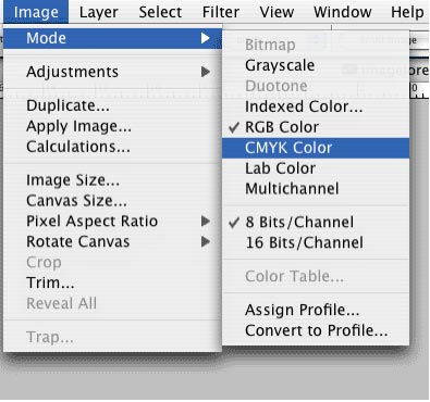
The above example of converting from RGB to CMYK is from Photoshop. Every application we accept uses a color palette that allows for a CMYK color space. DO NOT use "Indexed Color," "Duotone," or RGB color spaces.
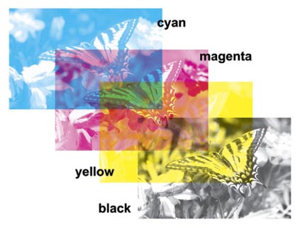
CMYK is also called 4-color Process. Colors in CMYK images are composed of varying amounts of Cyan, Magenta, Yellow and Black. This is the way a printing press prints color, so it is vital that your image be in this color mode, or, grayscale/bitmap (which only use Black). The images below show a CMYK image and the same image "separated" into its 4-color components as an illustration.
Digital files must be built at the correct trim size with proper bleeds. In applications like InDesign, Illustrator and Quark, the document must be created at the final trim size, and from there, you must extend any artwork that touches the trim edge past the trim by 1/8" for the bleed. In Photoshop, create your canvas at the bleed size (trim size + 1/4". eg: if your trim is 4"x6", then create your Photoshop canvas at 4.25" x 6.25") and then use guides to show your trim (set your guides 1/8" back from the edge of the canvas). Please download and use our templates to ensure correct page size.
Text, borders, or images that are not meant to go the edge of your card must be 1/8" from the trim edge of your layout. Images that are meant to go to the edge of your card must extend 1/8" past the trim for your bleed.
The Post Office requires all mailing postcards to meet certain requirements and may not mail them properly if there are mistakes. We are not responsible for artwork provided by the customer that does not meet U.S. Postal Regulations. We print what you send us!
Raster (bitmap) graphics such as TIFF's and JPEG's must have a resolution above 300 dpi (dots per inch). Images with a resolution less than 300 dpi may reproduce poorly on press.
You must supply ALL fonts used in your layout as we may not have them in our font collection. If you do not supply fonts, you may be asked to resubmit or we may be forced to substitute them. If you are submitting PDF or EPS files, make sure that all fonts are embedded or converted to curves to avoid this problem.
Our production process is such that we can only accept specific file types from specific professional graphic design applications. We HIGHLY prefer high-quality PDF files. Be sure to abide by the same file preparation guidelines as with the other, accepted applications
As your files travel across the Internet, they can get stripped of vital code that identifies them as valid TIFF's or EPS's or whatever the original file type is. Without compressing your files, you run the risk of sending us incomplete or "corrupted" digital files. Use a WIN-ZIP compression program to send your files.
If you are submitting a native file you must supply ALL images used in your layout (we cannot print your order without them). If you do not supply your images, you will be asked to resubmit them. If you are submitting a PDF or EPS file, make sure to embed your placed image(s) to avoid this problem.
The main purpose of calibrating is to set white and black points, contrast, brightness, and gamma (midtone density).
Since monitors differ from one to the next (even same brand and models), no two will respond in exactly the same way. The older your monitor is, the more likely it will lessen in both brightness and clarity. For color critical work, most monitors are dependable up to only two years. Some are better. Some are worse. You will have to be the judge. Calibrating your monitor is very important for color critical work. Do this a minimum of once a week. Even high-end soft proof workstations require frequent recalibrations.
You will need software to calibrate your monitor. Adobe Gamma (supplied with the Windows version of Photoshop) and Monitor Calibrator (Mac OS only) are simple to use. Both programs have "wizards" that can guide you, step by step, through the process. There are also a variety of more sophisticated software that can be purchased from third party developers, as well as high-end software that is included with the purchase of a monitor that is specifically designed for color critical applications.
Please remember that all color is relative to the computer screen you are using, the lighting conditions, the display settings on your computer, the paper you are printing on, etc.